En
- En
- عربي
- Deutsch
- Français
- Español
- Русский язык
- 한국어
- Nederlands
- Português
- 日本語
- Türkçe


Let's Have A Chat
We Have A Exclusive Offer For New Customers! Would You Like To Get Customized Packaging Solutions?
Let's Have A Chat
Would You Like To Get Customized Packaging Solutions Now? Just Leave Some Details And Our Team Will Contact You Quickly!

NEWS
INFORMATION

NEWS
INFORMATION
Matte vs Glossy Lamination: That Tiny Detail That Makes Or Breaks Your Coffee Bag
2026-06-10 15:52:21
Click:
“
Last week I had a total 'wait, what?' moment in our sample room. Two roasters ha
”

Last week I had a total 'wait, what?' moment in our sample room. Two roasters had sent us EXACTLY the same design files. Same logo, same gold foil stamp, same text layout, same bag size. The only difference? One checked 'matte lamination' on their order form, the other 'glossy'. When I put them side by side, I literally couldn’t believe they came from the same print run. One felt like a $20 specialty single-origin. The other felt like the $5 grocery store bulk coffee.
I used to think lamination was just a boring afterthought—something you pick at the last minute without thinking. Boy, was I wrong. This tiny, almost invisible choice changes how people perceive your entire brand before they even read a single word on the bag.
Why They Feel Like Completely Different Products
Lamination isn’t just about protecting your print from scratches. It’s about the first 0.2 seconds when someone picks up your bag. That split-second touch is what makes them put it in their cart… or walk away.
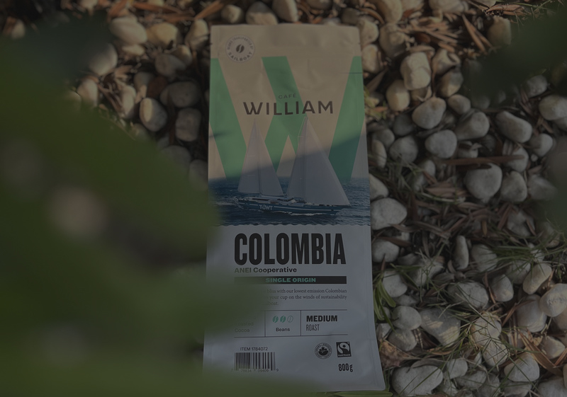
Matte lamination eats light. No glare, no shine, just a soft, velvety surface that feels almost like thick, textured paper. It’s quiet. Understated. When you add foil stamping, the shiny gold pops so hard against the flat background it almost looks 3D. And it never feels salesy. You could put the most over-the-top logo on a matte bag, and it would still look classy.
Glossy lamination is the exact opposite. It’s like holding a mirror. Light bounces off it so hard it can almost hurt your eyes in a bright supermarket. Colors pop like crazy—reds get redder, blues get bluer. But it also has that unmistakable plastic feel, and it shows every single fingerprint and smudge. I’ve had clients complain their sample bags looked dirty after 10 minutes of being passed around.
Which One Should You Actually Pick?
It’s not about which is more expensive (they’re almost the same price, for the record). It’s about what you want people to feel when they pick up your coffee.
Go Matte If…
- You’re a specialty or small-batch roaster
- You want to feel premium without trying too hard
- You’re using foil stamping or spot UV
- Your design is minimalist and uses lots of white space
9 out of 10 of our specialty coffee clients go matte. Last year, a tiny roaster from Oregon switched from glossy to matte and told us their online sales jumped 27%—and the only thing they changed was the lamination. People just automatically associate that soft, tactile feel with better quality. Our custom coffee bean packaging bags with matte lamination pair perfectly with foil stamping for flexible packaging for that quiet luxury look everyone’s chasing right now. Check out Coffee Review’s 2026 Packaging Guide for more on this trend.
Go Glossy If…
- You sell mostly in gas stations, convenience stores or big supermarkets
- You need to stand out on a crowded shelf
- Your design uses bright, bold, neon colors
- You’re targeting casual, on-the-go drinkers
Glossy works when you need to grab attention fast. If your bag is sitting next to 25 other coffee brands, glossy will be the first one people see. But be warned: it can make even the best coffee feel cheap. We had a client who tried glossy for their single-origin line and had to reprint 50,000 bags because customers kept asking if it was the same old generic grocery store coffee. The Grocery Store Packaging Report 2026confirms glossy finishes still dominate mass-market food aisles.
The Big Secret No One Tells You
Luxury packaging doesn’t come from fancy graphics or expensive add-ons. It comes from the details people feel but can’t name. A plain black matte bag with one tiny gold foil logo will always feel more expensive than a busy glossy bag covered in 10 different design elements. It’s that simple.
All our lamination films meet FDA 21 CFR food contact standards and EU regulations, so you never have to worry about safety. We also offer soft-touch matte lamination for an even more premium feel, and recyclable options for our sustainable coffee packaging line. For more technical specs on lamination durability, check out Packaging World’s Lamination 101 Guide.
My #1 Pro Tip
If you’re on the fence, just order samples of both. Send them to 5 of your regular customers and ask which one feels more like your brand. I’ve never had a group disagree—everyone picks the same one within 2 seconds of picking them up.
If you need help figuring this out, shoot me an email. I’ll send you a free swatch book with all our lamination options, and we can talk through what makes sense for your brand.